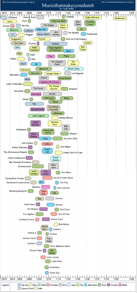
I find data mash-ups like this absolutely fascinating. Totally anecdotal, useless for anything other than starting an argument or feeling smug/outraged, but impossible to look away from. It was made by comparing the reported list of favorite bands from Facebook with the average SAT scores of the university that those students were attending.
So yeah, it’s a completely made-up signifier, one that purports to reveal some hidden correlations, but which is maddeningly vague. Â I mean, are Billy Joel fans really smarter than Foo Fighters fans? Or is it just some combination of Jersey-boy favoritism and Ivy League colleges skewing things?And AC/DC fans smarter than Doors fans? I mean, who really believes that the shop class dirtheads out-IQ the pretentious poets?
A larger point to ponder is the amount of data we all have voluntarily contributed to public places, and the ways that data is available to even casual researchers to aggregate, thin-slice and draw conclusions from. Imagine someone with a slightly more robust databank figuring out how to correlate the playlists on Last.fm and Pandora with the incidence of buying Crocs sandals and voting Democratic in local school board elections.
We all make judgments about each other based on surface impressions – it’s what the book “Blink” was about. A couple of bearded guys in an aging VW Microbus is such a cliche that I’ll bet you immediately thought “hippie.” The cops do things like this with bumper stickers, such as when they revealed that 90% of the time they pull over a car in LA with a KROQ bumper sticker, they routinely search it for drugs (when this was reported, two things happened – KROQ screamed bloody murder and thousands of stoners went outside with razor blades and started scraping furiously). Gang members do it with shoelaces, and screeners at airports do it with twitchy body language.


Trackbacks/Pingbacks