To quote Michael Corleone: “Everytime I think I’m out – they draaaaag me back in!”
 I just got done with a Big Scary Article for the NAA about charging for online content. I’ve marinated myself in all sorts of arcane data about how to make money from online content, whether or not publishers are being forced to charge for content or are doing it because they are angry and unwilling to make the fundamental changes to adapt to the New Media environment, etc. etc. Basically, a whole bunch of business theory that makes me sound like a Web 2.0 dweeb, spouting buzzphrases like “Freemium is a viable long-term marketing strategy, but a short-term disaster if you need to make crushing debt-service payments,” and “Big Media brands must leverage their local trust networks to sign up small advertisers.”
I thought it was all behind me, but it turns out that the Online Publishers Association has been hard at work trying to solve the underlying problem with online advertising – that is, that the basic unit of banner ads, really don’t work all that well. Here’s their proposal:
“As consumers and advertisers increasingly turn to digital media, we must create formats and programs that support and sustain the differentiating aspects of our businesses,†said Martin A. Nisenholtz, founding chairman of the OPA, and senior vice president, digital operations, The New York Times Company. “Agencies must be given the tools to build brands on the Web and publishers must provide the formats for their advertisers to thrive, while balancing the needs of their users.â€
The proposed new advertising units are:
- The Fixed Panel (recommended dimension is 336 wide x 860 tall), which looks naturally embedded into the page layout and scrolls to the top and bottom of the page as a user scrolls.
- The XXL Box (recommended dimension is 468 wide x 648 tall), which has page-turn functionality with video capability.
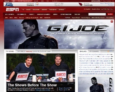
- The Pushdown (recommended dimension is 970 wide x 418 tall), which opens to display the advertisement and then rolls up to the top of the page.
I have mixed feelings towards these things. As a web publisher myself, I am in favor of anything that delivers real value to advertisers, since if advertisers get value, then they’re much likelier to direct fat stacks in the general direction of indie weasels like me. 
However, as a web surfer, the idea that sites are going to have annoying “Fixed Panels” that follow me as I try to scroll through the page … well, have you ever gone to a MySpace page where the background is busy and annoying, and all the content scrolls across it, increasingly impossible to read? It’ll be like that. The Fixed Panel is going to judder and jerk as you use the scroll wheel, and if you’re a person who has multiple tabs open in your browser, well … hope you’ve upgraded your RAM and you have at least four cores going in your CPU to handle all the load.
The XXL Box is a bit more promising. If an ad is actually visually appealing, and it is delivering information about something that I’m interested in, then I would consider it to be part of the content of a page. If it has page-turn capability, and can also display a short video clip, well, that might be amusing.
But the Pushdown – oh Christ. Where do I start.
This reminds me of the takeovers that most sane publishers did away with a couple of years ago. The one that sticks in my mind is the takeover on Yahoo for Batman Begins, where a crazy swarm of bats exploded out of the ad, covered the Yahoo page to turn it mostly black, and then the text advertising the movie then appeared.
Hard to ignore, I’ll give you that. But at the time, I was using Yahoo as my default email address. The ad slowed things down so much that I switched over to Gmail. This, despite the fact that I know that Google is scanning all my email messages and indexing everything I write, or that is written to me.
aaa

